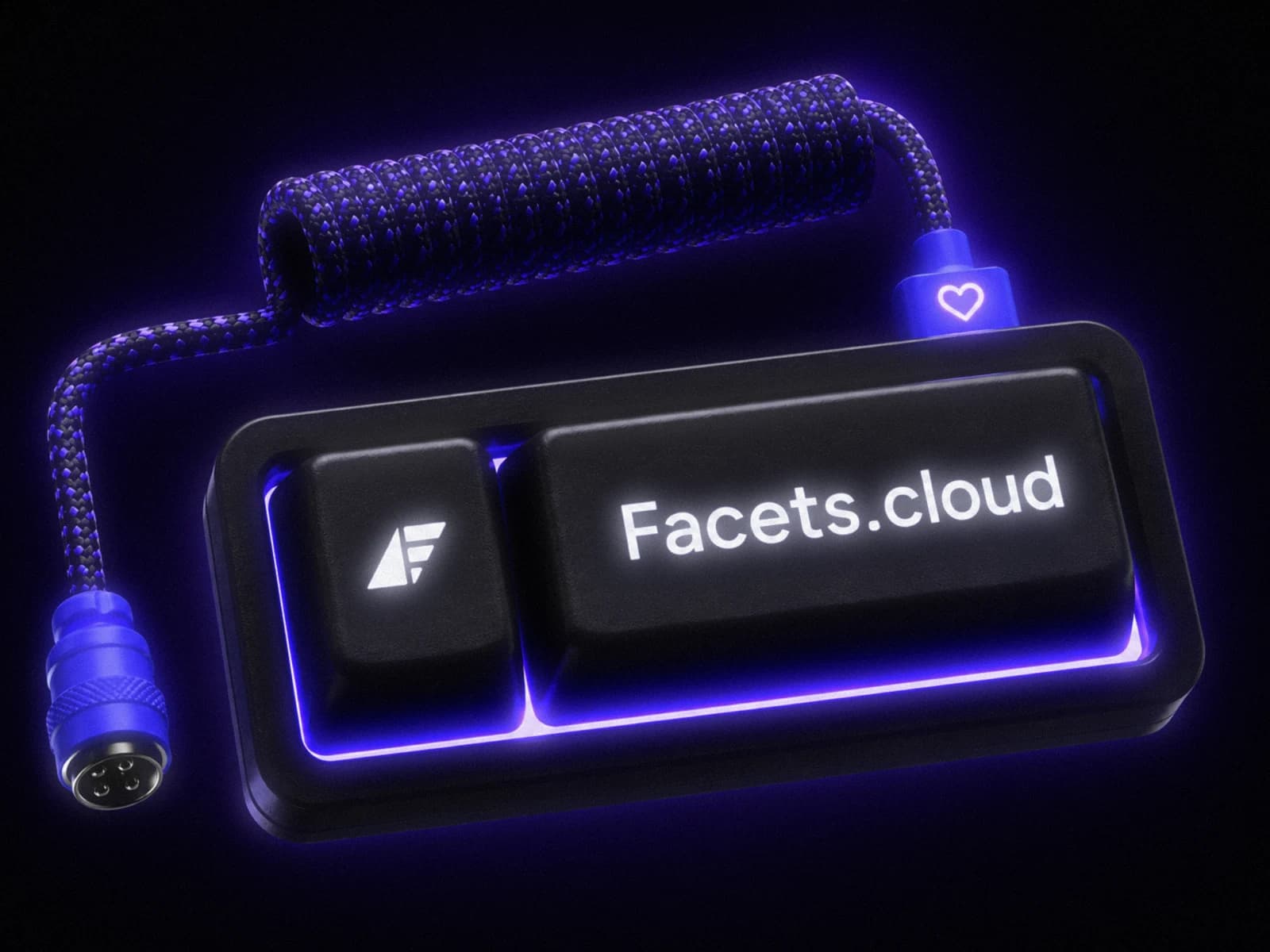
i came in as a creative designer and ended up touching most of the surface a product shows the world.
the disciplines
one product, and the disciplines are just the route through it. the rows below run outside in: from a banner on a street, through the feed, the films, the motion, and the site itself, down to the glyphs inside the product.
for the past eight months i've built a consistent visual identity across every platform: ad campaigns, live events, product launches, community posts. i designed each asset myself, so it all reads as one brand.
print and events
the same system off-screen, at the two sizes where you can't fix it afterwards: one that has to land from across a room, one that gets read holding it.
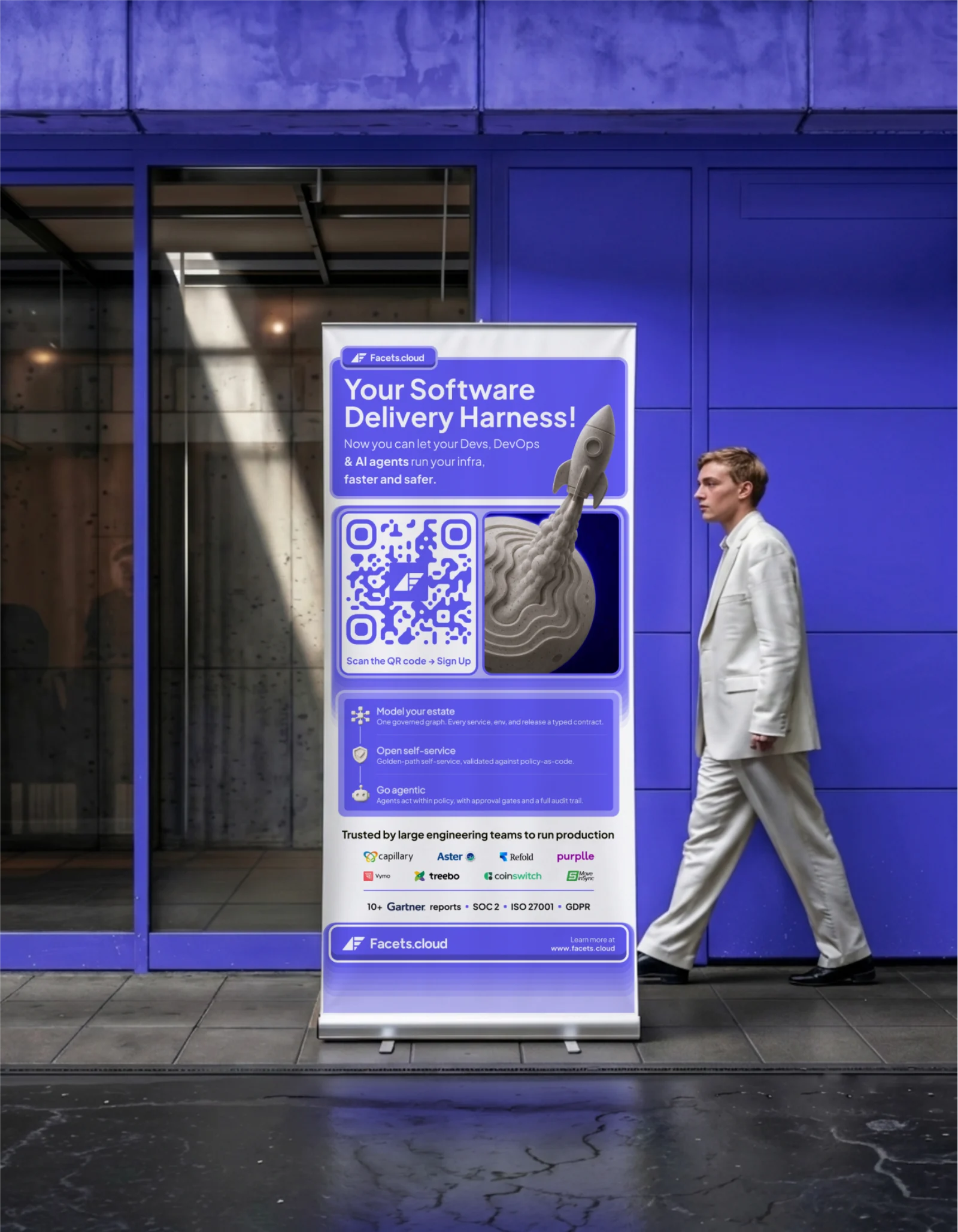
the roll-up, shown at street scale 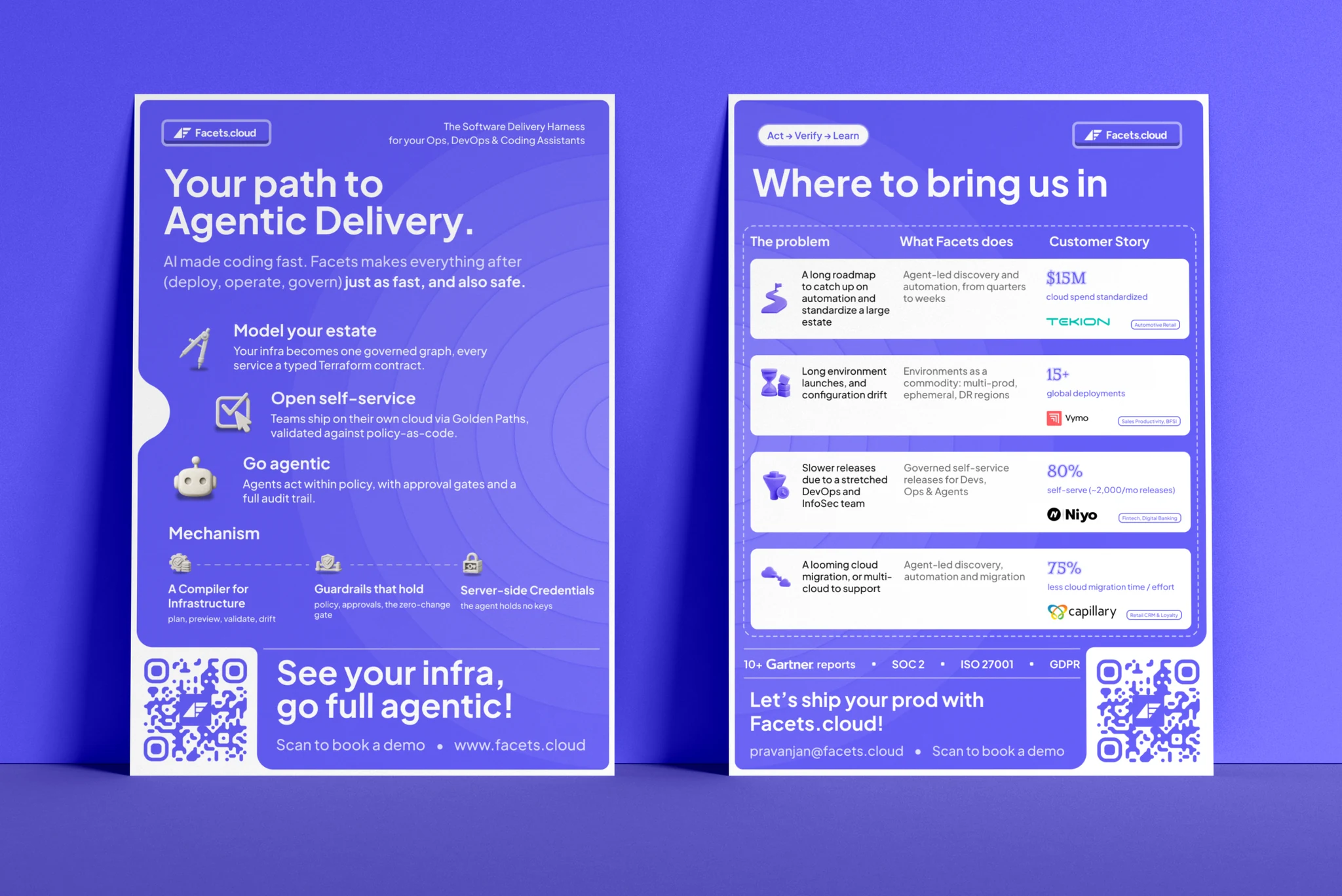
the two-flyer set — the pitch, then where it fits the product hunt launch
then the full launch kit for praxis, our devops ai agent, the day it went live on product hunt. the announcement, the workflow explainer, the social proof, and the customer wall, one visual language across all of it so it held up in a fast, noisy feed.
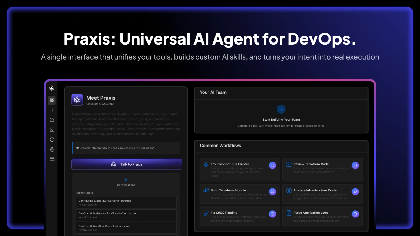
the announcement 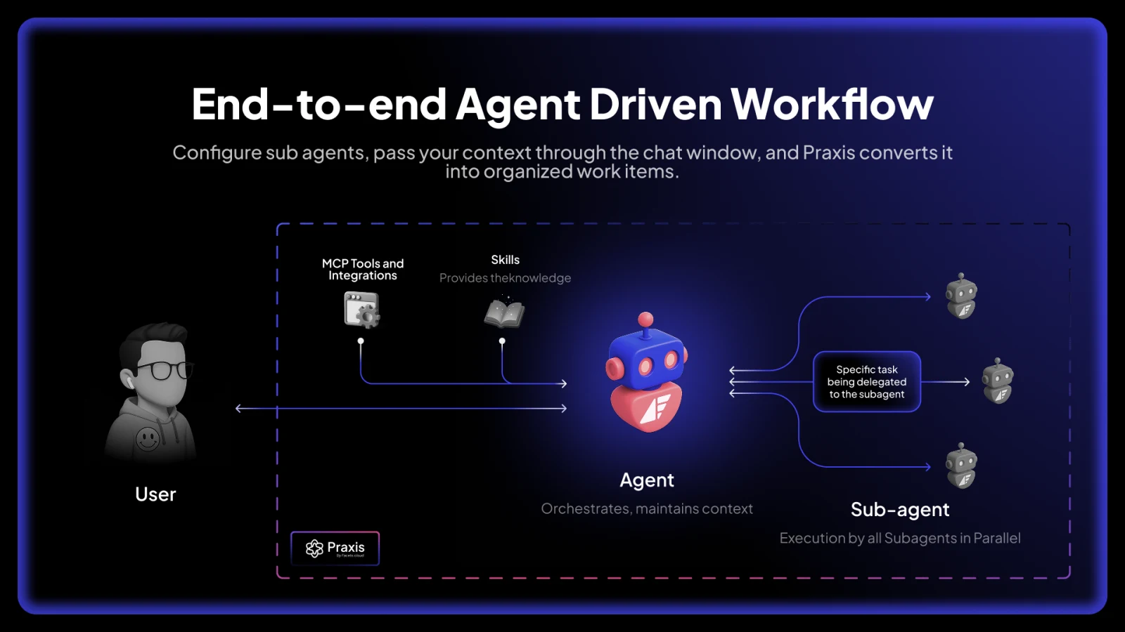
how it works 
social proof 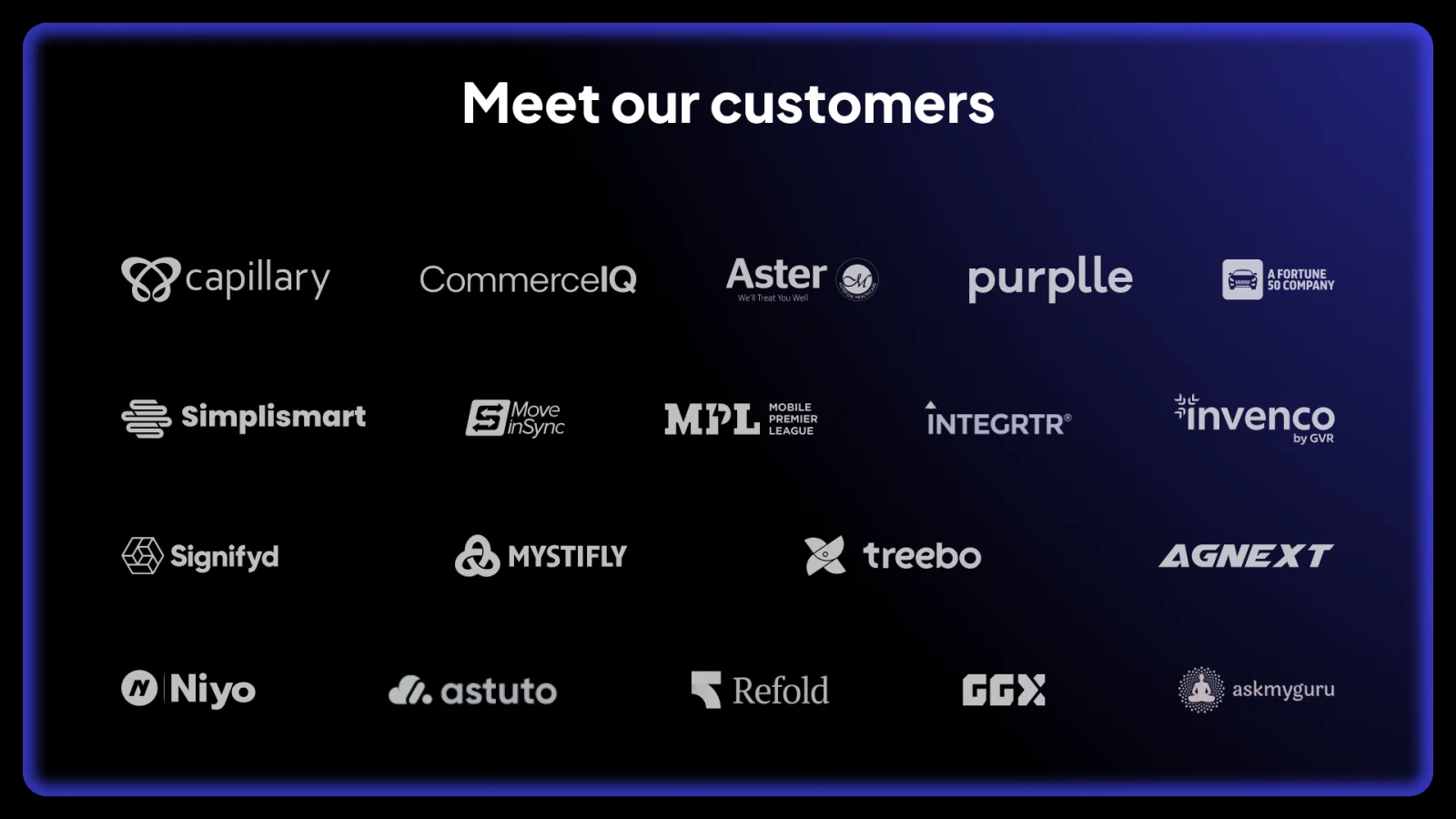
the customer wall it shipped publicly on product hunt.
see the product hunt launchthe youtube system
i rebuilt the youtube channel end to end: the header, the thumbnail system (up top), and the playlist and podcast covers, drawn for clean hierarchy and contrast so the message lands even mid-scroll.
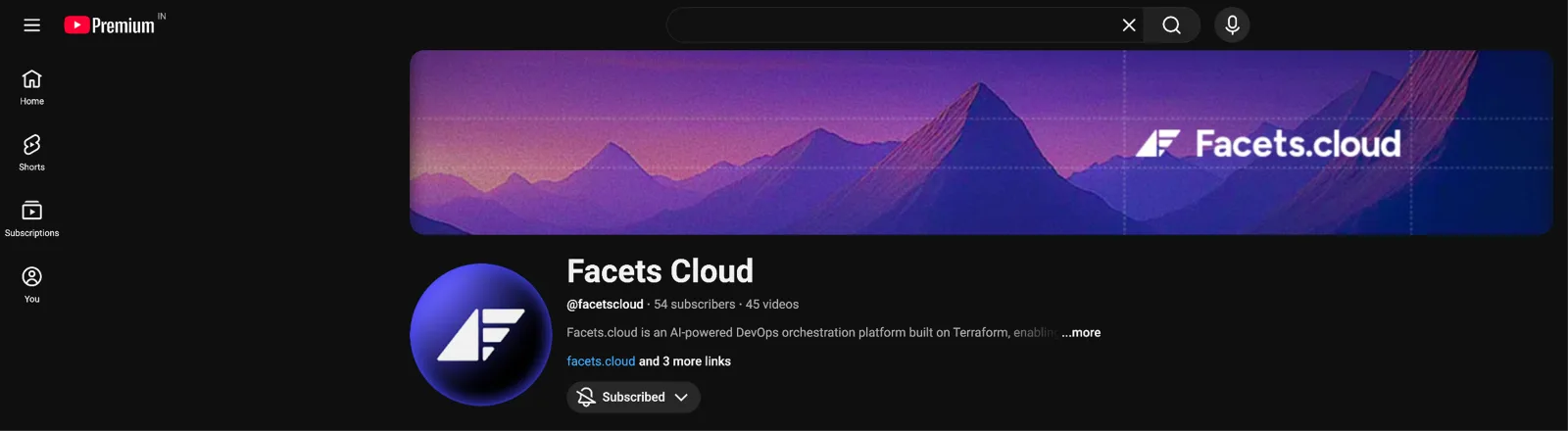
channel header 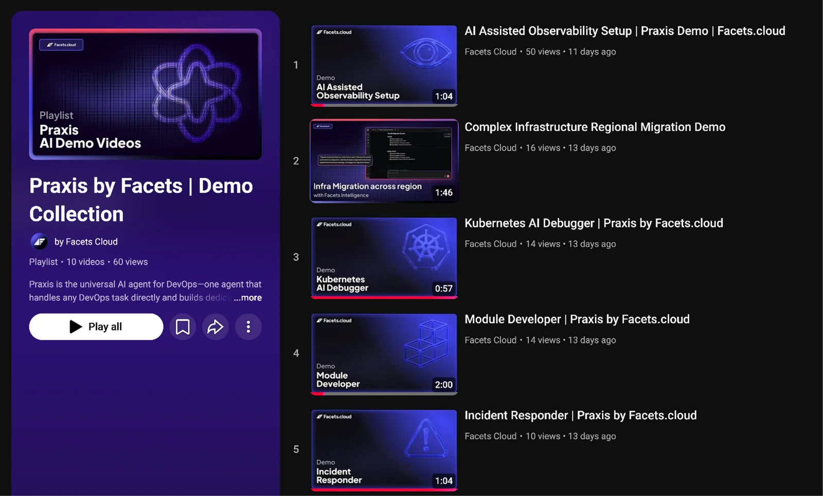
the praxis demo playlist 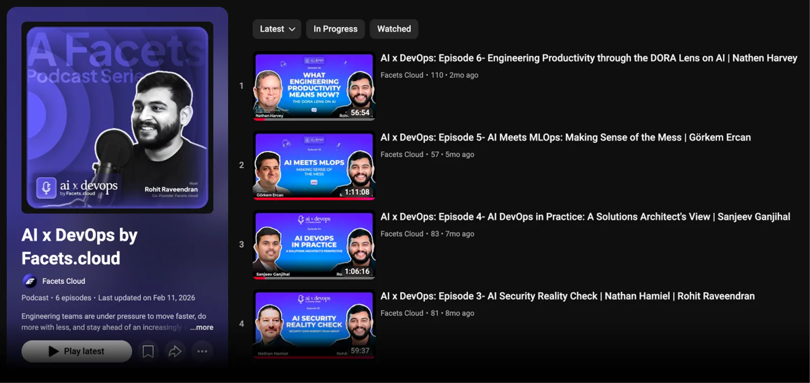
the ai x devops podcast collateral
the same direction carried off-screen, onto cards and event standees, so the brand looks the same in a feed and in a room.
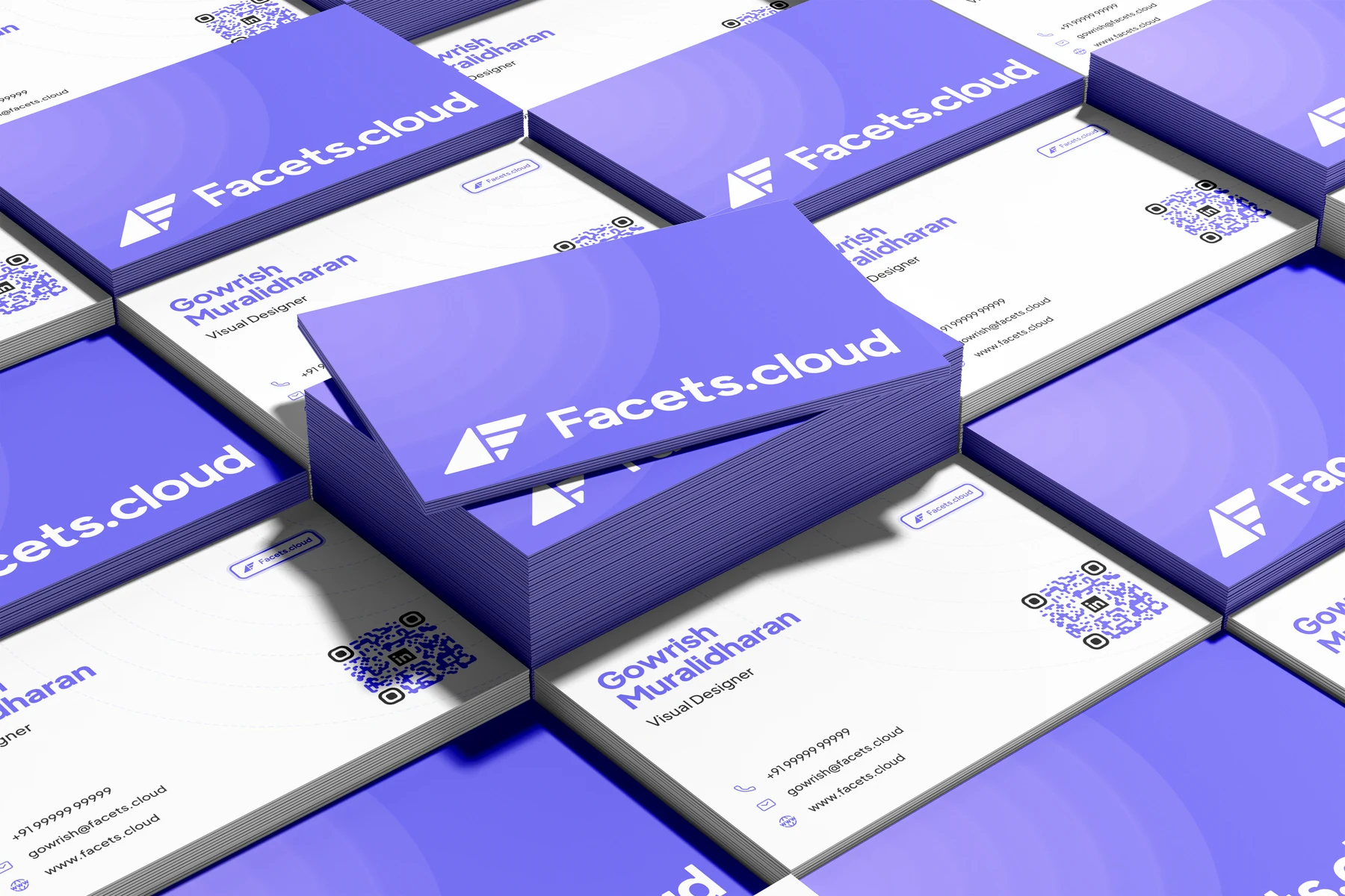
business cards thanks for scrolling
one system, carried all the way into print.i'm a growing video editor, nearly a year of saas product videos, podcasts, and office hours for cloud-tech startups. i keep the cuts sharp, clear, and well-paced.
product demos
feature walk-throughs and launches, including the product hunt launch film.
product hunt launch office hours
webinar edits, longer-form, kept clear and easy to follow start to finish.
5 days → 60 minutes
the one i'm proudest of. a short product video showing how facets takes a workflow that normally runs five days and brings it down to an hour.
product demo, the 5-days-to-60-minutes story i started the script as problem-and-feature, then turned it into a story. i refined the voiceover with ai to cut the jargon, and used elevenlabs to keep the delivery steady. every line is matched to real screen recordings. i shot more footage than i needed, then trimmed to only the moments that made the feature believable. fast cuts, montages, and timers for energy.
it pulled 40,000+ organic impressions in three days, the best-performing post so far, with no ads behind it.
what's real matters more than what's refined.
podcast
conversation edits, pacing the cuts to the talk, not over it.
thanks for scrolling
launches, demos, and one product hunt film.i started on motion about six months ago, animating frame by frame in canva to learn movement, then moving to lottie and after effects for real work. timing, flow, the small details.
lottie
lottie files are just lightweight json. they stay crisp at any size and barely weigh anything, so they're easy to put straight on the site.
cost-saving, lottie cloud-migration checklist migrate to gcp the loaders
the first motion you see while a page warms up: lightweight, transparent logomark animations. the praxis sphere is the heavier moment for the longer waits.
logomark loader 
praxis loader campaign motion
these began in canva while i was still learning, then moved into after effects as i got more comfortable.
multi-cloud cost savings unified pipeline cloud observability thanks for scrolling
frame by frame, until it moved right.i designed the facets.cloud pages in figma and built them in vscode with next.js, the figma mcp bridging the two. clean, on-brand, and quick to move through.
the live site
it shipped. a screenshot doesn't do a built site justice, so see it for real.
open the live sitefacets.cloud, live - the harness section the difference - code has a compiler, ops never did design and build, same hands
designing and shipping the same pages changed how i designed them. i made the supporting pieces too (the loader, banners, thumbnails, and open-graph images) so the site feels connected page to page instead of stitched together.
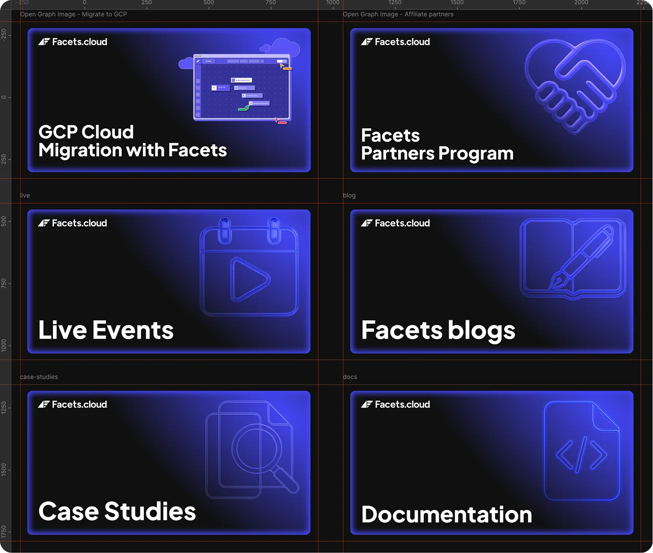
open-graph image set, one per page type the footer
one of the coolest custom footer i've ever designed and built: the cta band, the sitemap columns, the newsletter signup, and the partner badges. the background is a live canvas, a flickering grid that ripples under the cursor. it's meant to be touched, so here it is, recreated. move across it, or click.
move/click for ripplesthe footer's live grid, recreated. move + click to ripple. closest to the product
this is the work that got me nearest the product. i worked directly with the ceo and picked up the low-level details, which pushed me to be more creative while staying aligned with how the thing actually works. the revamp is in progress now.
thanks for scrolling
the work that got me closest to the product.the full set, on its grid. hover to bring the icons up. small surfaces, big consistency. i drew the nav icons to be simple and balanced, so the menu reads at a glance and still feels like the brand.
the set
one weight, one corner radius, one way of drawing a metaphor, so a set of icons sitting next to each other look like they came from the same hand.
the marketing marks — 18 glyphs, drawn on the wider campaign grid the same set exists a second time as two-tone gradient art. it carries its own colour, so it can't be recoloured the way the line marks can, and it gets its own row rather than being mixed into the grid above.
the gradient set — 12 two-tone marks, framed as drawn thanks for scrolling
one hand, one grid, dozens of glyphs that read as a set.


thanks for scrolling