
datacogniq turns messy data into decisions. the identity had to look engineered without going cold. something that holds on a pitch deck and a dashboard alike.
about the company
datacogniq builds data platforms, data engineering, warehousing, analytics, and cloud, for teams that need to trust what their numbers say. the work is consultative and engineering-first: they take a company's scattered, messy data and turn it into something a decision can stand on.
the brief
the brief came down to one line they kept repeating:
turn information into actionable insights.
so the system had to feel dependable before it tried to feel clever. their work is consultative and engineering-first, and the brand had to match it: calm, precise, the same wherever it shows up.
the mark
the monogram reads as scattered data points resolving into one shape: the before and after of a transformation, in a single glyph.
the wordmark stays geometric so it holds at any size, on a fixed grid with a minimum size and clear space pulled from the mark itself. rules so it survives other people's decks.
the palette
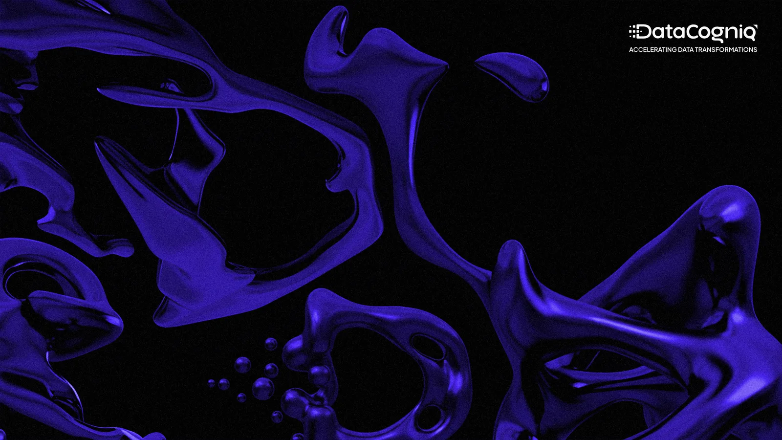
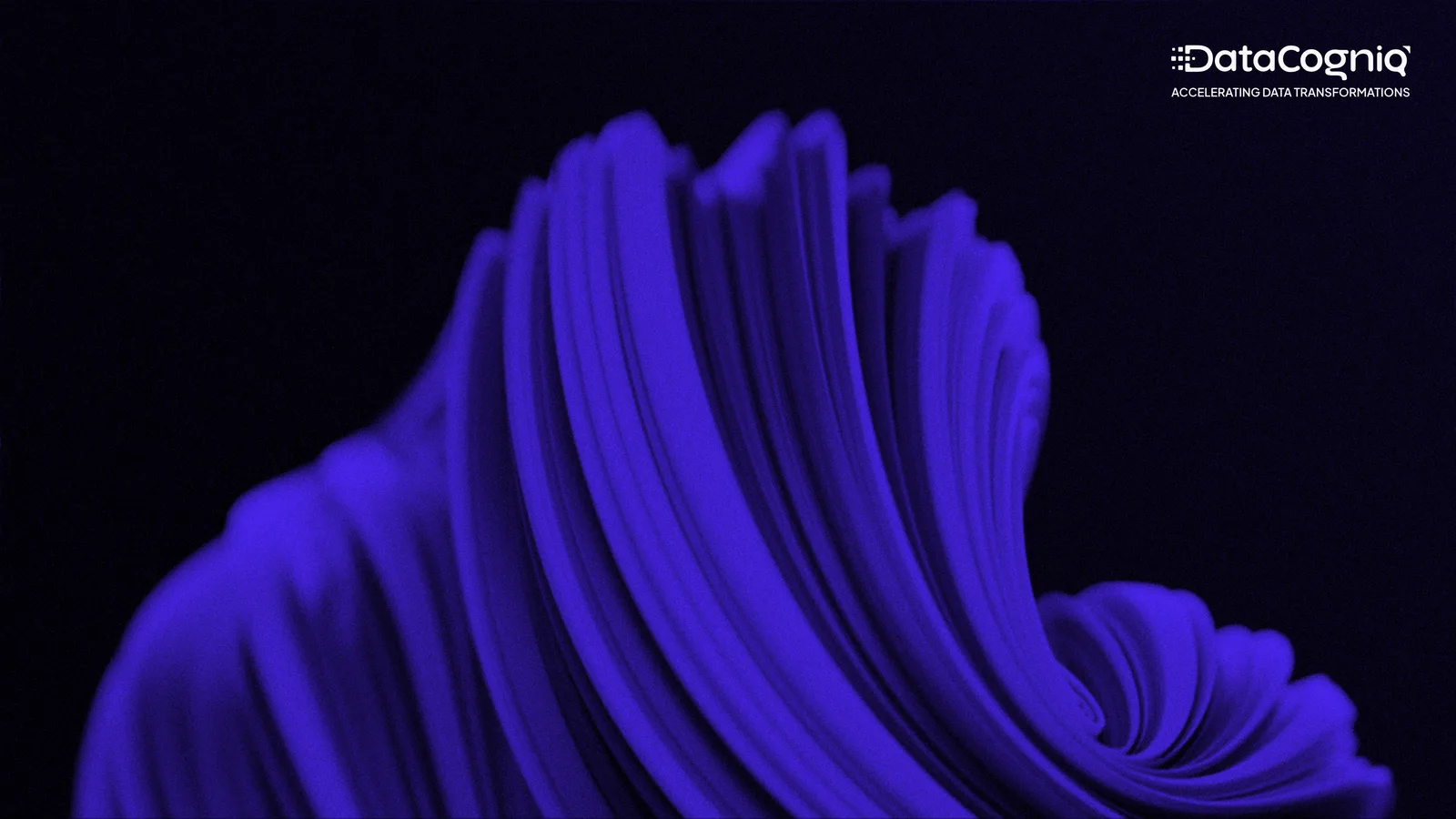
near-black and white do the heavy lifting, so the brand reads calm and engineered. one electric indigo, pulled through the data-point gradient, is the only place it raises its voice.
type
plus jakarta sans carries it. clean and legible across screen and print. the weights do the hierarchy; nothing is there for decoration.
thanks for scrolling