for the past eight months i've built a consistent visual identity across every platform: ad campaigns, live events, product launches, community posts. i designed each asset myself, so it all reads as one brand.
ad campaigns
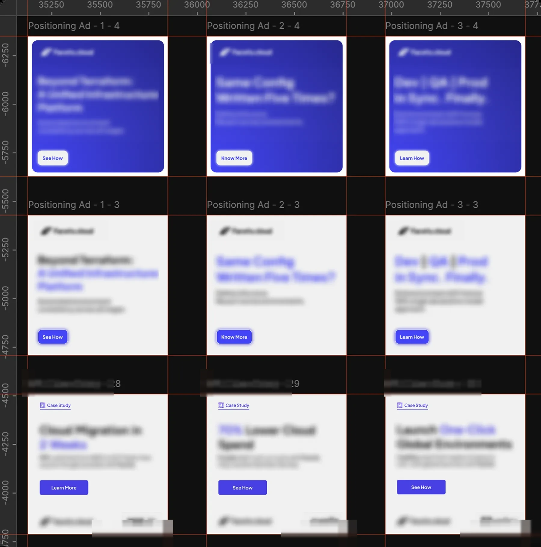
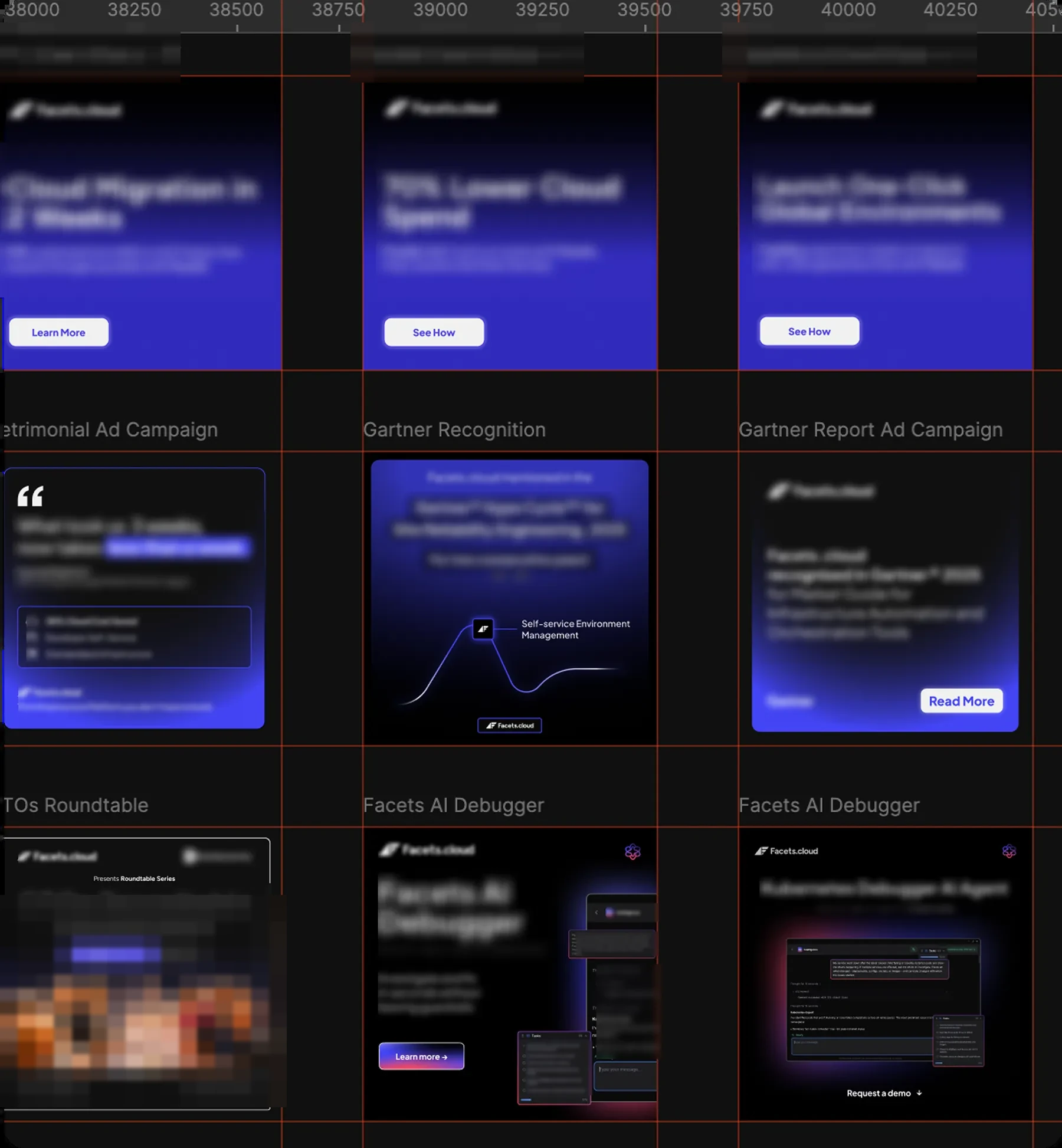
the ads carry the brand into the feed: same light, type, and palette across the set, so it reads as one campaign while each post still sells its own thing.

the product hunt launch
then the full launch kit for praxis, our devops ai agent, the day it went live on product hunt. the announcement, the workflow explainer, the social proof, and the customer wall, one visual language across all of it so it held up in a fast, noisy feed.
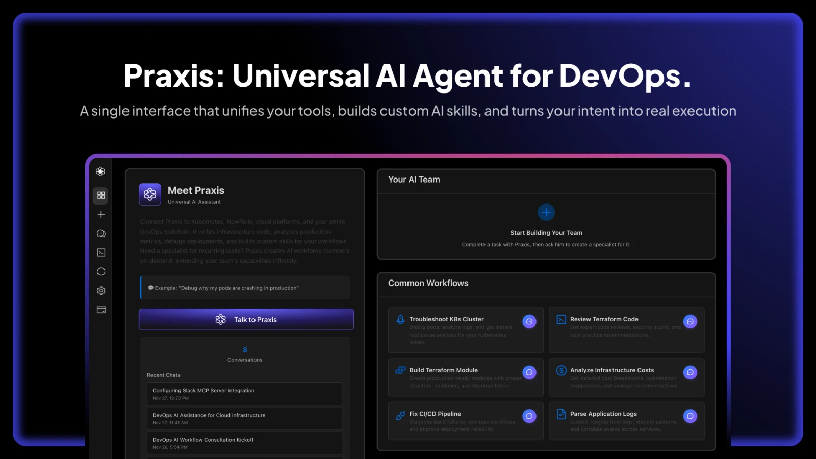
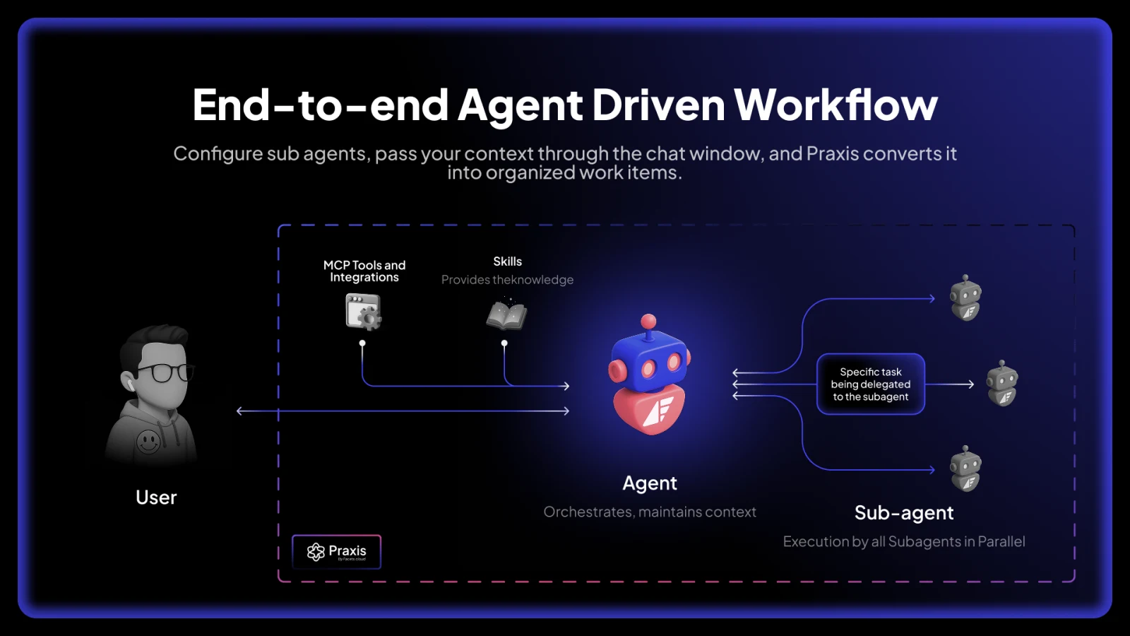

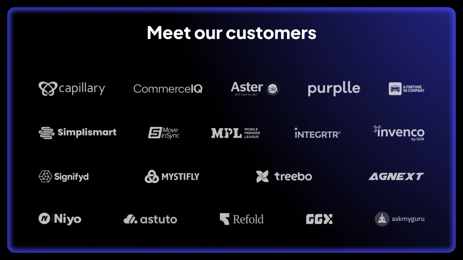
it shipped publicly on product hunt.
see the product hunt launchthe youtube system
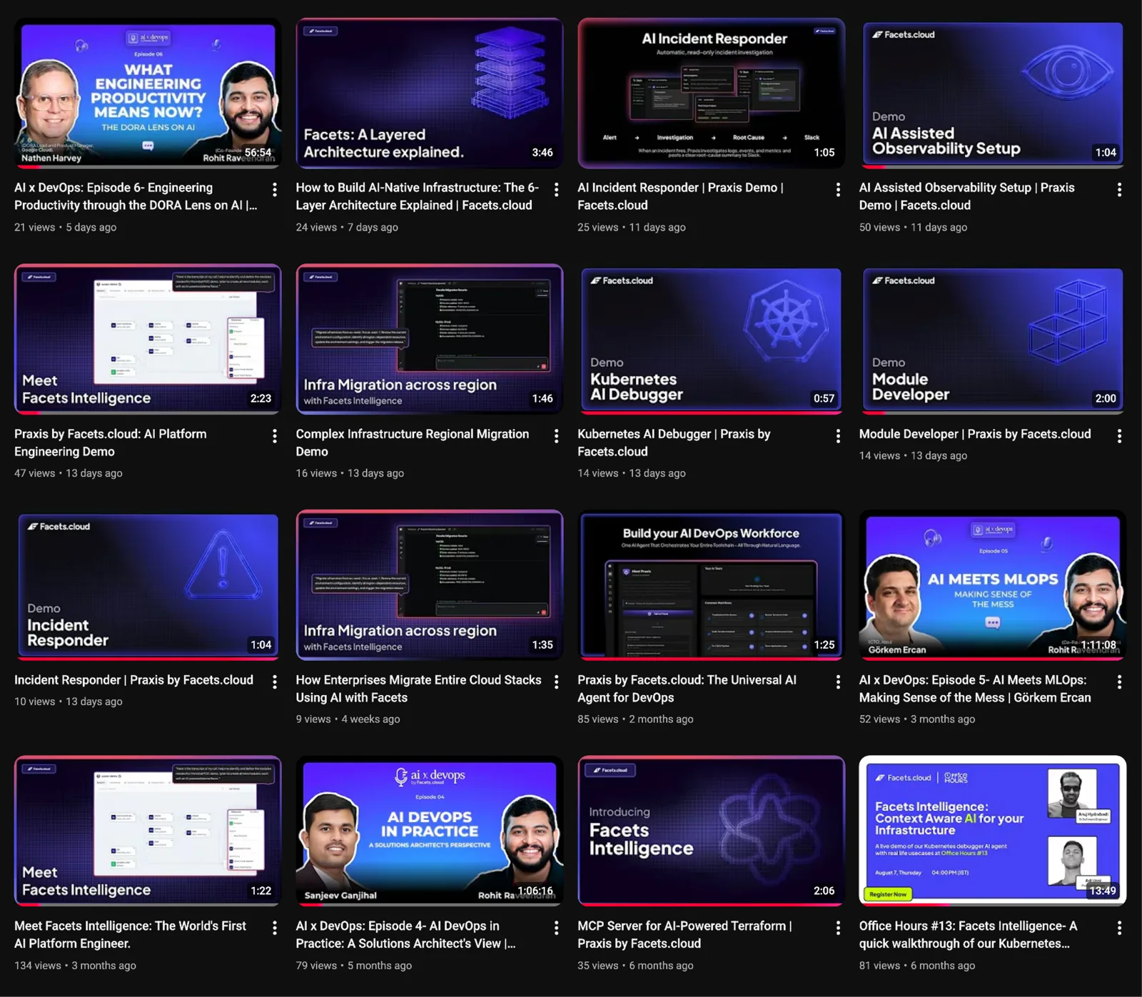
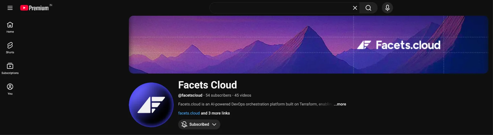
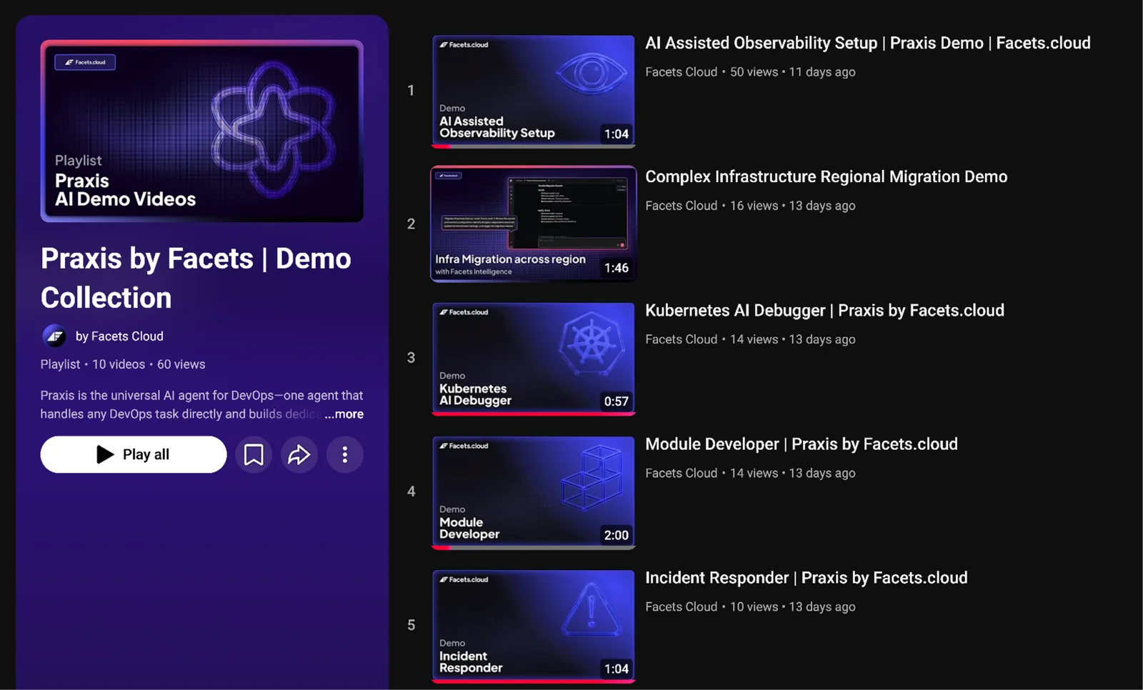
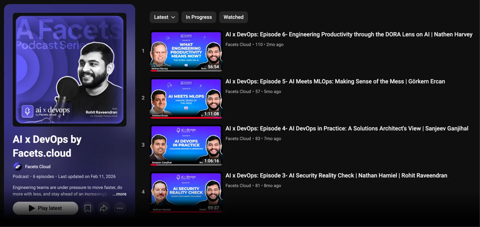
i rebuilt the youtube channel end to end: the header, the thumbnail system (up top), and the playlist and podcast covers, drawn for clean hierarchy and contrast so the message lands even mid-scroll.
collateral
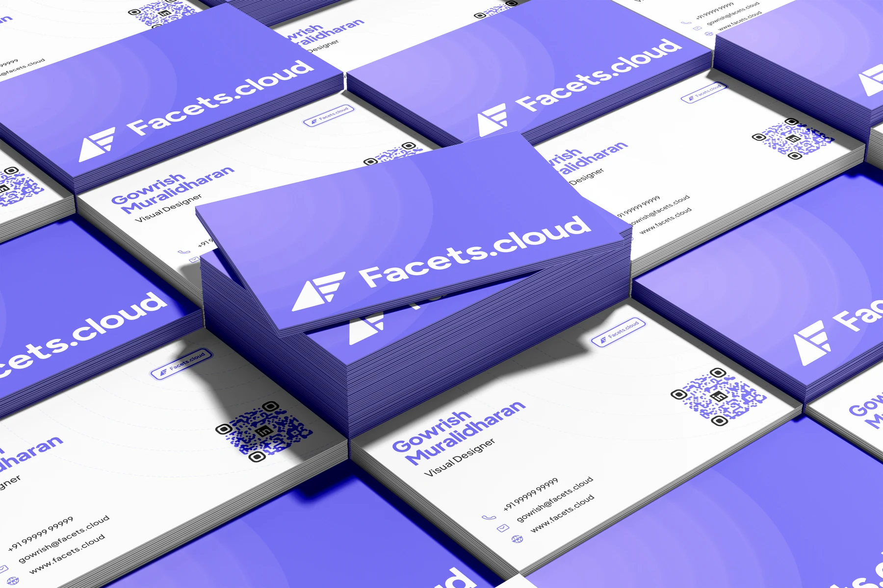
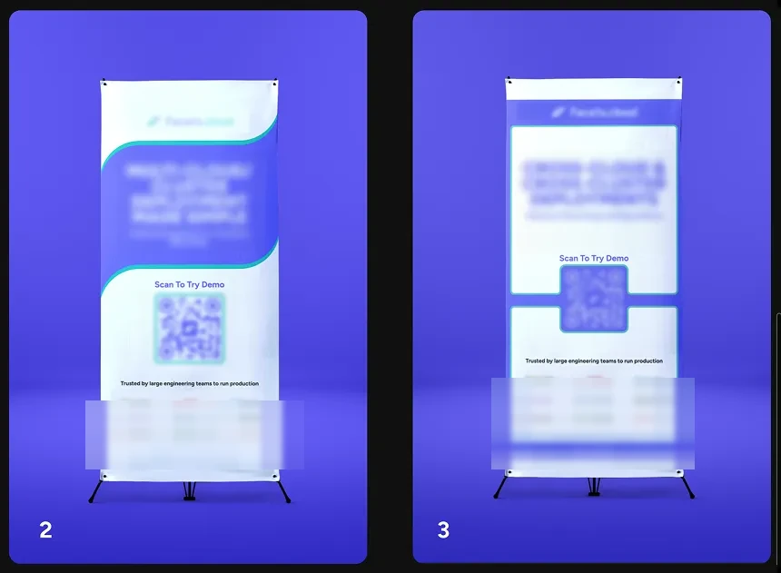
the same direction carried off-screen, onto cards and event standees, so the brand looks the same in a feed and in a room.
thanks for scrolling