
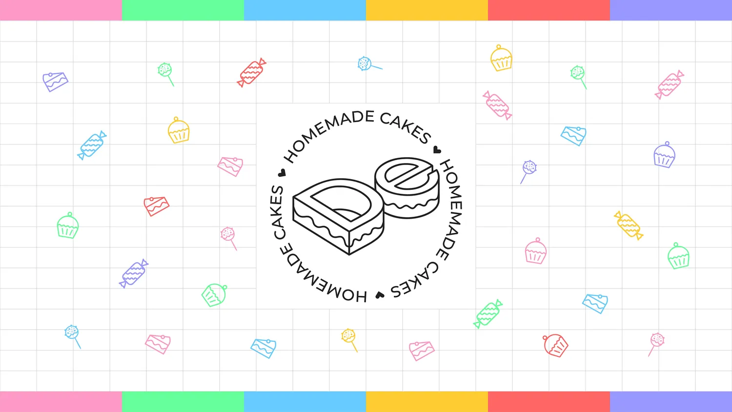
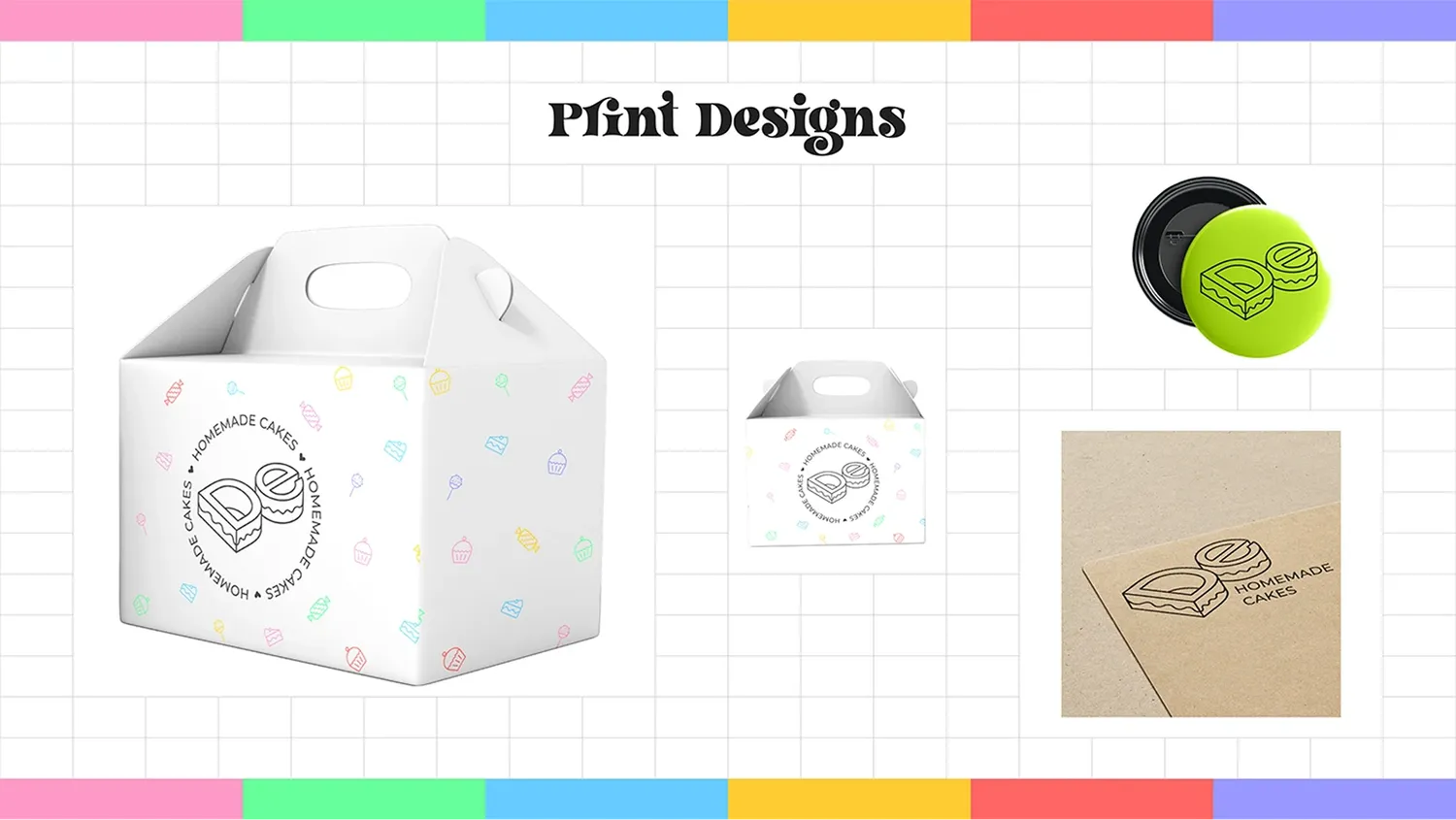
a small brand for a home baker. the mark folds a "d" and an "e" into two little cakes and wraps them in a "homemade cakes" ring: warm, hand-made, easy to spot on a box.
the mark
a monogram first, a logo second. it had to read at thumbnail size on a phone and still feel hand-iced.
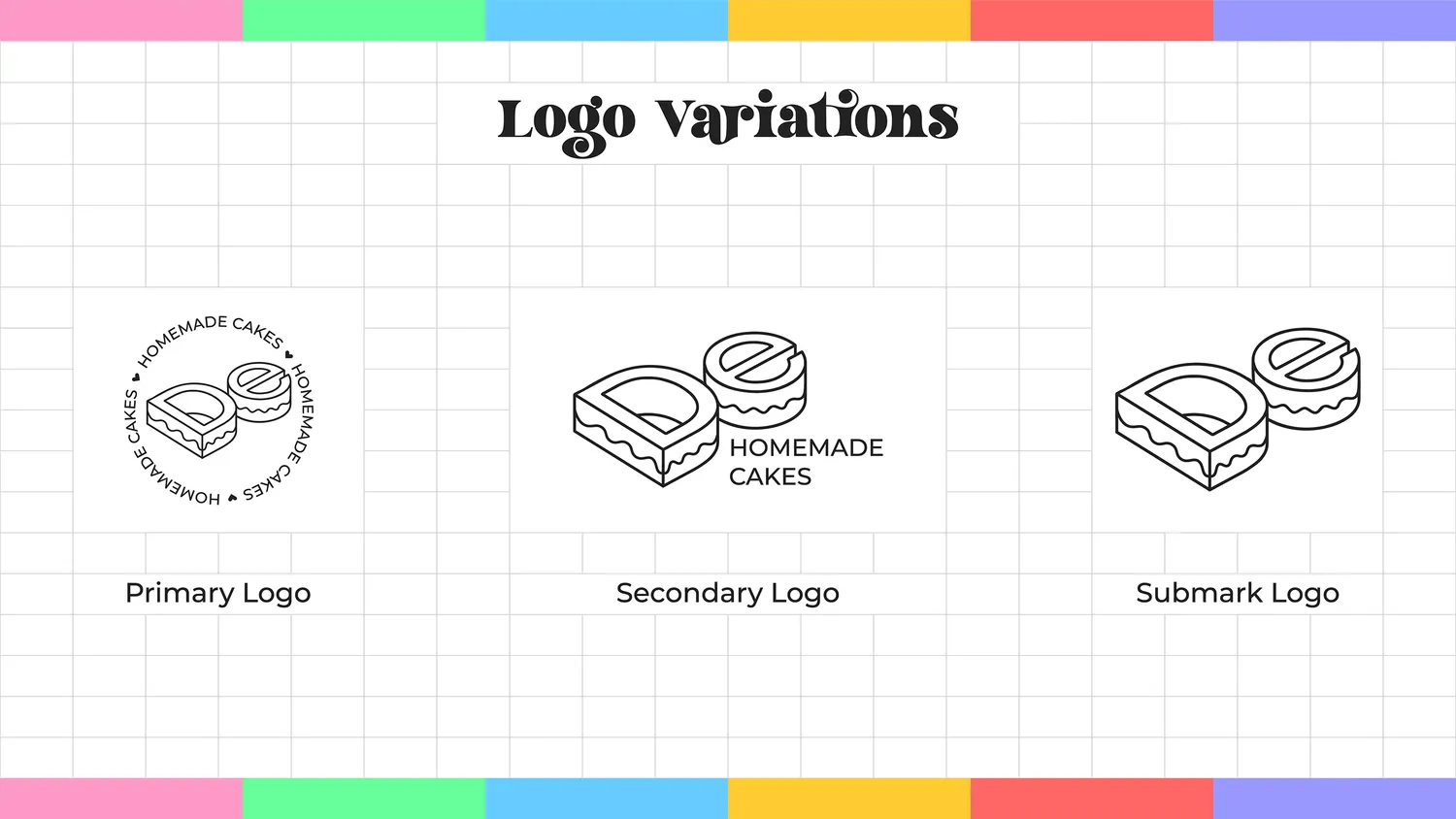
the system
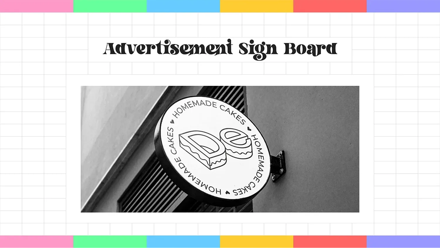
one identity, drawn out into the pieces a small kitchen actually uses: logo variants, a palette and type pairing, cards, social, packaging, and a sign for the door.
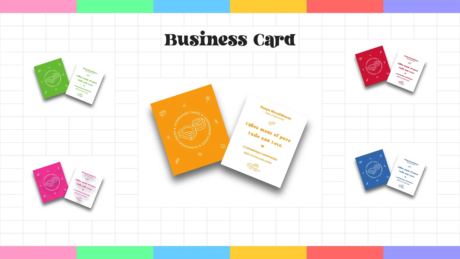
palette
six candy brights, one for every mood the box might be in.
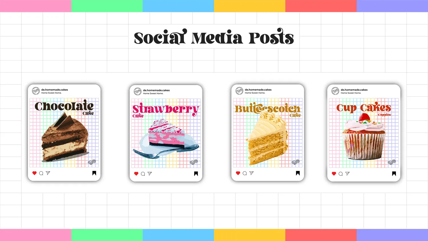
type
display is set in letter magic; the rest runs on montserrat, across regular, medium, and bold.
in use
the same identity carried onto the pieces a small kitchen actually hands out.
thanks for scrolling
cakes made with love; a logo to match.